BioUML user interface


| This page or section is a stub. Please add more information here! |
In either version the platform has a WIMP graphical user interface.
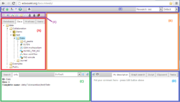
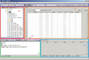
Both in the BioUML workbench and BioUML web edition the following areas can be found (see the figures):
A — the tabbed repository pane, where you find a collection of Databases, the uploaded Data files and the available Analyses methods (under the corresponding tabs), organized in a hierarchical tree structure. Here you can also see a list of Users involved with the current project.
B — the document pane (aka main pane or workspace), which is the part of the window where contents of projects and databases are viewed and handled. There can be as many tabs in the pane as there are diagrams, workflows, tables etc. opened in the workbench at the moment.
C — the information box containing tabs for the property inspector, which displays information about the data file or analysis method selected in the navigation pane above, and the text search engine.
D — the viewparts area, providing a number of options under the different tabs in a context-dependent manner.
E — the general control panel, the topmost bar showing a context-dependent set of icons for the available operations.
F — the repository pane toolbar containing a set of icons for the available operations depending on the item selected in the tree structure of the navigation pane.
Contents |
List of icons
Repository pane
Tree actions (web edition)
-
 Run workflow
-
 Open external link
-
 Open diagram
-
 Open view
-
 Open track
-
 Open sequence
-
 Open table
-
 Open text document
-
 Open optimization
-
 Open analysis
-
 Open script
-
 Open document
-
 Open image
-
 Open plot
-
 Open as table
-
 Download file
-
 Start chat
-
 Group chat
-
 Edit work
-
 Expand/collapse
-
 New element
-
 New JS script
-
 New R script
-
 New workflow
-
 New diagram
-
 New work
-
 New folder
-
 New optimization
-
 View
View
-
 Import
-
 Export
-
 Save a copy
-
 Copy folder
-
 Remove
-
 Remove project
-
 Find project
Database types
 Public database with read access
 Protected database with read access enabled
 Public database with read access, write access disabled
 Public database with read access, write access enabled
 Public database with read and write access
 Local database
 Remote protected read-only database (no access)
 Remote protected read-and-write database (no access)
Element types
-
 Diagram
-
 analysis
-
 collection of sequences
-
 file
file
-
 folder
-
 galaxy data source method
-
 galaxy method
-
 html
html
-
 image
image
-
 matrix
-
 matrix library
- module
-
 profile
-
 script
-
 sequence
-
 site model
-
 table
table
-
 text
text
-
 track
track
-
 tree-table
Information box
 View the information in a new window / browser tab
 Edit the element description displayed in the Info tab (only for users' own files; fields highlighted in pink are editable)
 Launch search for the entered term in the selected database
Viewparts area
 Edit
Edit
 Save
Save
 Add a new element
 Start search
 Discard changes / clear elements
 Execute
 Add/ apply to the item in the document pane
 Add to a new diagram
 Stop (the selected tasks)
 Accept the layout edited in the document pane to the viewparts area
 Remove
 Add to clipboard
 Insert into the diagram
General control panel
Toolbar actions (web edition)
-
 Log-out
-
 Log-in
-
 Start page
-
 Start page
-
 Toggle UI mode
-
 Toggle repository
-
 Account info
-
 Project properties
-
 Help
Help
Basic operations
Menu items containing one or more files (file collections) can be expanded/collapsed to show/hide their sublevels. Any such item, like a database, a folder, a track or a matrix library, has a white horizontal arrowhead to the left of its icon and name in the file tree area.
To expand an item
- click on the white arrowhead (the arrowhead will become black and downward),or
- click on the item name and then on the Expand/collapse icon in the repository pane toolbar above, or
- right-click on the item and select the Expand/collapse option from the context menu.
To collapse an item
- click on the black downward arrowhead next to the icon and name of the expanded item, or
- click on the item name and then on the Expand/collapse icon in the repository pane toolbar above, or
- right-click on the item and select the Expand/collapse option from the context menu
If the menu expands beyond the current visible area, use the horizontal and vertical scrollbars.
Handling files
When the mouse pointer hovers over a file, the file name will gain a faint-bluish background.
Upon a single click on a file name, its background will turn into a persistent light blue, and information about this file will be displayed in the property inspector tab of the Info Box.
Double-clicking on a file name will open it under a new tab in the document pane, and the file name will be emphasized in bold as long as the corresponding tab is in the document pane’s foreground. Only files with an icon attached can be opened this way.
Files can also be opened by:
- clicking on the file name and pressing the Open... icon in the repository pane toolbar, or
- right-clicking on the file name and selecting the Open... option from the context menu.
Similarly, you can delete chosen files by clicking on the Remove option in the repository pane toolbar or the context menu.
Most files can be exported. When the function is activated, a selection of different formats is provided for the export file to be generated. It is also available through the icon ![]() in the repository pane toolbar
in the repository pane toolbar
While the Open, Remove and Export options are present and work for nearly any file, the rest of the available operations is different among distinct file types.
Selecting input files
All analysis tools, and likewise all prepared workflows, require input data from a file in the repository pane. The respective file can be loaded into an analysis tool
- by simple drag-and-drop of the file from the repository area into the corresponding field in the document pane, or
- by clicking into this field and making the selection from the directory which opens.
Multiple selections can be done only in the second way.
Working with tables
Any table can be opened by double-clicking the corresponding name in the repository pane. The table will open under a new tab in the document pane (workspace).
The contents of the table are sorted according to the values in one of its columns. Being opened for the first time, a default column is defined for sorting, usually the ID column. This default column is indicated by a blue arrowhead. If this arrowhead points upwards, the table rows are sorted in ascending order of this column’s values. Clicking on this arrowhead will change it into a downwards pointing one and the values will be sorted in descending order. Correspondingly, you may sort the table according to the values of any other column in ascending or descending order by clicking on the up- or downwards pointing gray arrowhead on top of this column, resp.
At the top of the table there are buttons you can use to navigate between the individual pages of the table (if the number of entries in the table exceeds the default per page setting). It is also shown on which page out of how many pages in total you are. In the right top corner, the page size in terms of number of entries (rows) is shown and can be adjusted.
You can edit the contents of a table by pressing the Edit button in the right upper part of the pane. Now, you can manually edit the contents of each cell in the table. With the Apply option you will save the changes, while the Cancel button discards them.
Even without activating the Edit function, you can select
- individual rows with a left-click (the selected row will be highlighted in blue),
- several ones by keeping the
CTRLkey pressed, - a range of rows with the
SHIFTkey pressed when clicking on the last row of the range to be selected, or - Select all the entries on the current page or in the table by clicking on the corresponding buttons.
The selected rows can be saved as a separate file, which by default is given the name <original file name> subset, but you can change this name.
